We had a group critique of our design sheets with Pip today. There were 7 of us in the group. One of the main things that became apparent was that my lights smart application was quite niche! Not quite as niche as Martha’s – a light in the shape of her Italian ancestral home that would be linked to the properties motion sensors and flash when edible dormice were running about to annoy her grandad, but niche! I could see the further potential for Martha’s idea though, which opened my mind to other, less niche uses that mine could be put to.
Martha’s movement sensors could be used for anyone with a second property either in the UK or overseas to alert the owner of movement and get someone to check it out, whether it be pest control for rodent visitors or police for human! My pressure sensors could be used for all sorts of things too – for anyone who keeps stores of anything and needs alerting when something needs replenishing, they could be placed under a doormat to count footfall or to trigger an intruder alert. I had been very focused/blinkered on the beekeeping idea without looking at the bigger picture, so the group critique opened me up to new possible end uses for my design.
Not much was said about mine, I’m not sure if that’s a good or a bad thing! I had covered most bases – I had researched artists who had influenced my design, researched materials, researched the market for similar existing products, researched my target audience, all of which were picked up as areas to explore further with other members of the group.
It was interesting to see that everyone had developed an idea that would be useful or helpful in some way – nothing entirely aesthetic or frivolous was brought to the table. I felt really sorry for a couple in the group who had got so far with their idea’s only to find upon continued research that their product was either already in production, or had been rendered obsolete by new scientific thinking – lesson learned – do thorough research before investing too much time, energy or money in a project!
Today we went to Elan Valley to walk off some of the Christmas excesses. I took lots of photos of the stunning scenery, but I also kept an eye out for anything else that caught my attention and these glass rectangles in metal frames on the path around a building by Caban Coch dam fascinated me.
The colours in the glass, rust, lichen, cobwebs, cracks, dirt, reflections and whatever lay below were just so beautiful.
When I got home I googled Hayward Brothers, Union Street London and found this article on the history of the company. Turns out to be quite apt for our ‘light’ project.
It turned out so much better than I had hoped! The flour and water actually form a much stronger glue than I had dare hope and it is actually quite sturdy. As there are some cones with no paste on, and some with a dark and heavy paste, the light is of varying strengths all the way around which creates interest. Because of the opaqueness of some of the cones, light is also tunnelled into spotlights that beam onto surrounding surfaces, creating additional patterns & interest. It could be made in any bespoke colour combination to suit any room/decor. I know I share too many images and should probably should only have half of these, but I couldn’t resist:
I had a very useful chat with my husband, who keeps bees. I was telling him about my day and the amazing technology that Ingrid had shown us (IFTT & SamLab) & he got very excited about how this technology could be helpful to him with his beekeeping.
To be honest, I was delighted that he found a hobby when he started the beekeeping course, but he soon became a total bee geek and I stopped listening to him, so I don’t know a great deal about it! But he was saying that through the winter they don’t exactly hibernate, they just huddle together to maintain an constant temperature . As they can’t go out much – they need to maintain the temperature, and there’s not much pollen to be had anyway, they rely on their stores of honey to feed on and see them through the winter months. Because beekeepers take honey from the hives in the summer to use and sell, depleting their bees winter stores, they help their hives through the winter by giving them additional food in the form of sugar syrup or fondant to make sure they have enough to see them through. They have to keep disturbing the bees when checking how much of the syrup or fondant is left, which is a risk to the bees and can only be done on sunny calm days which are few and far between in winter! Peter said it would be great if there was a way of notifying him if it was running low to minimise bee disruption. 💡
Peter, Jill & Andy checking the hives
So this is going to be my idea for my design sheet. It might be a bit niche – only aimed at beekeepers, but it would be very useful to that niche market! I will research the SamLabs blocks that we were shown by Ingrid as they have a pressure sensor which would be able to measure the weight of sugar syrup or fondant left and send an alert via my light, either by changing colour, or as it’s bee-related I quite like the idea of keeping the light colour the same but making it buzz when the weight drops below a certain point!
I have done a little research and only found one product similar to my idea:
It does a lot of things but doesn’t specifically measure the amount of food left, which from what my husband has said and what research I have done is the only thing you really need to worry about with bees through the winter. The rest of the functions might be of interest to some, but the enjoyment for most beekeepers seems to be checking the hives for these things themselves, going to beekeeping meetings etc…it’s a hobby, not a means of getting honey.
I want my actual light to be related but in a more abstract way – no bees, honeycomb or honey yellow! I just want it to be a beautiful object you would be happy to have as a bedside lamp or on your side table in the lounge to compliment your decor.
I brought a sheet of tracing paper home with me and started playing with it – seeing what happened when I put clear varnish on it and how soft pastels behaved on it (my favourite/go-to medium).
The first thing that came to mind when we were told about the tracing paper was some artwork I saw in the RWA annual open exhibition a few years ago. Laurie Steen is an RWA Academician who sketches trees on mylar – a form of tracing paper. I’m not 100% sure what medium she was using, but from the ethereal ‘smudginess’ of the backgrounds, contrasting with the sharp black lines of the trees, it looked like charcoal. This is what made me think of working with pastels – I keep saying it, but I love colour so prefer pastels to charcoal – they behave similarly though. My plan had been to simply make a pastel sketch of our beehives on the tracing paper – they are in a beautiful landscape setting as you can see from the photo above – then putting it in a box frame with the light behind it so it would be a decorative artwork during the day and a useful light by night. But then I thought that might be a bit more Fine Art than Artist, Designer, Maker.
I then thought about manipulating the tracing paper, but I didn’t want to jump on the bandwagon & do origami, so I ruled that out straight away. I came up with making little tubes which when joined together looked like a wasps nest structure, not quite on topic, but not a million miles away! I wasn’t sure how to turn this structure into a light, but then I thought if I made the tubes conical then I could make them into a dome over an upturned bowl as a former which could be removed once the glue had dried. The light bulb would then sit in the centre, et voila! Lamp!
Ecology is a major reason beekeeping is becoming so popular, with the worrying decline of bees across the world. When I realised I needed to glue bits together, I thought it would be appropriate to try using organic flour and water to make a glue paste like I did when I was a child. Not sure how long it will hold, but there’s no plastic in it and by using organic flour, no pesticides will have been used in growing the wheat. Pesticides are thought to be one of the main reasons behind the decline of bees. It would also be possible to add subtle colour to the paste by going back to my original thought of using pastel – I could simply make a powder from soft pastels to add to the flour and water.
I was horrified when I later searched pinterest for ‘tracing paper light’ and found images almost identical to what I had made by a San Francisco artist named Mary Button Durrell! It even said she used paper & wheat paste to make them (i.e. flour glue!!!) So much for my original idea…
I considered going back to the drawing board, but I had limited time and I had already invested half of the time I had in this idea by this point. I decided mine will be different enough, as I will be colouring the flour and water glue with pastel dust, it will be smaller, dome shaped and a lamp rather than a sculpture, but I was still pretty devastated!
Also, on further research I found that tracing paper is not very environmentally friendly – it is not recyclable as it is made transparent by using cellulose fibres to make it translucent. Tracing paper is essential to the project though, so there’s nothing I can do about that. If I were to make it for real, then I would consider making it out of another material, perhaps clay.
Today we started our first ‘field’ module. We have to make a light using only the bulb, tracing paper and one other material. We also need to prepare a design sheet which can be more of a fantasy design – something we could make if we had all the the time, materials, funds and techy knowledge we required! I have some research to do for that one so more blog posts will follow, but for now I am working on the physical light that must be completed by next Tuesday.
We had a soldering tutorial which I will be documenting here – the light design will be in my sketchbook where it’s easier for me to scribble and sketch images and ideas.
Soldering an LED bulb to wires in order to make it attachable to a power source:
The bulb has a longer and a shorter metal prong. The longer is the positive, the shorter the negative.
You will need equal lengths of red and black wire. Red is positive, black negative. Prepare the wires by stripping about an inch of the end of the wire of its plastic coating, leaving just the metal exposed. Twist the metal to keep it from splaying.
Twist the metal part of the red wire around the longer prong and the metal of the black wire around the shorter prong. Place one of the wires in a grip/vice.
Make sure that the tip of the soldering iron is clean by wiping it on the wetted sponge. The temperature of the soldering iron should be around 300 degrees (just past half way on the dial). Use the tip of the soldering iron to heat the wire and prong – solder is attracted to heat, so if you try to solder it cold, it may just drip off. After heating for around 10 seconds, apply solder.
The solder will produce smoke/fumes. Do not inhale this – if only doing a small amount of soldering in a large well ventilated room then just move your head out of the way, but if you are in a small room or are doing quite a bit then use an extraction system or wear a mask.
Once you have soldered both prongs, you need to cover both connections with heat shrink tubing to protect them. Put the tubing in place and use a heat gun to shrink securely in place.
You will then need to strip another inch of plastic coating from the other ends of the wire in order to attach it to the power source. The power source will have 2 wires – one has a white stripe (positive) and one is plain black (negative). For our tutorial, Jon attached the power source wires to a chock block, which we then touched our wires to to check that our soldering was good and the bulbs worked. Once we have a plug I guess we solder them together (check with Jon!)
Always make sure you attach positive to positive (long, red, white stripe) and negative to negative (short, black and solid black) otherwise you will kill the bulb.
For our first Field/Collaborate module the theme is light and we have been asked to write a research blog post on this theme including 3 images with a short explanatory text.
It is something that has been on my mind lately as now that the clocks have gone back and the nights are longer, a lot of places that you would normally visit during the day and in the summer months such as gardens and stately homes are trying to increase their winter revenue with nighttime events involving light installations.
I guess this raises the question of whether these installations are art or just christmas decorations/events. Where do you draw the line? I’m not so sure, so I’m not going to include them in my 3 pieces, but just thought I would mention as it’s something that’s been on my mind!
So…
Dezeen
Since Pip recommended I look at the Dezeen website for my design sheet I have been hooked! Here’s a couple of lighting designs I’ve seen on the Dezeen website:
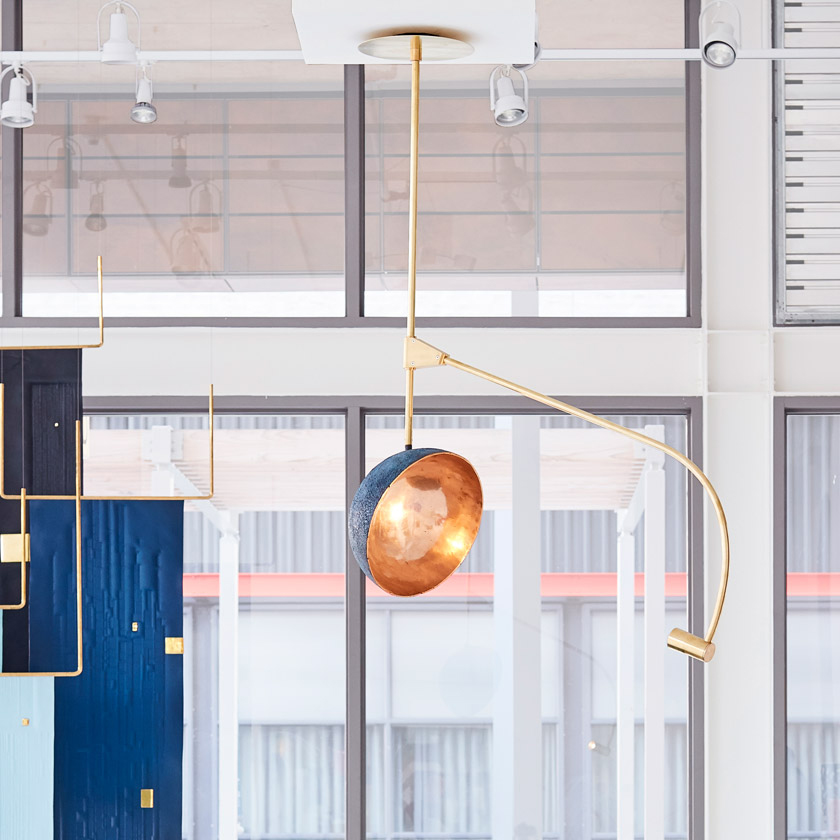
I love most things about this – the concept, the way the light goes from a warm glow reflected in the shiny bronze interior or a cool blue when reflected from the blue exterior, that you can swivel it around, that “According to the designer the dome creates a “waxing and waning shadow” on the ceiling above the light, creating an ever-changing cinematic experience.” It’s just beautiful and clever and could have been cheap and tacky looking, but it’s very elegant. If you click on the link there is a video of it moving around. I was a bit disappointed that it has to be manually turned. I do wonder whether it can be made to properly orbit around though – so it’s constantly moving a tiny amount and maybe goes from the bright blue in the early evening to the warm glow later when you’re wanting to relax and getting sleepy.
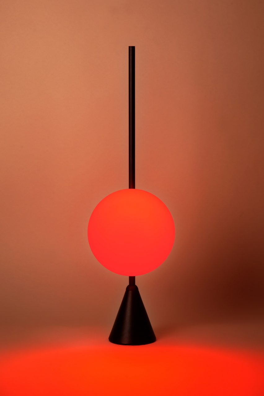
I like the idea behind this and that it might actually be helpful as well as beautiful. I like that the light slides up and down and changes colour, but I wonder if it can be made to come on as dusk falls and go off as dawn approaches, gradually changing in line with the sun on the opposite side of the hemisphere rather than having to be manipulated?
There are loads more interesting new designs – these are my 2 favourites!
2) Bruce Nauman – Neon artist
A lot of Bruce Naumans’ neon work portrays quite graphic sexual images, which aren’t really my thing, but he has done a few that aren’t so shocking. I get that neon lights are often associated with advertising, especially in seedy parts of cities and red light districts, but the pieces I like are the ones where he uses the flashing on and off of different lights to play on words, rather than making figures perform sex acts!
I chose this piece as it exploits the properties of neon lights. The wording is around the top of a building with 7 vices and 7 virtues overlapping each other – the neon lights alternate depicting either vices or virtues.
3) Antonio Gaudi – Sagrada Familia stained glass windows
For my third piece I wanted to explore stained glass windows. I am not religious, however I love colour and am fascinated by the idea of using the light of the sun to illuminate images and project them onto white walls like temporary light artworks.
Gaudi is better known for his architecture and mosaic work, but the windows in the Sagrada Familia are stunning. Unfortunately when I visited 20 years ago I lost my camera, so I don’t have any original photo’s, but the feeling of the colours washing over me will stay with me forever. They had only done one side when I visited, so I didn’t get to see the contrast between the scenes that are illuminated by the morning sun and setting sun.
Casting slip is in the left hand vat in the area next to the casting room. Never use the stuff in the other 2 vats as these are in the process of being mixed and aren’t ready. Make sure you switch on the stirrer and let it mix for a few minutes before using to make sure it is the correct fluidity. Pour enough into a jug using the tap at the bottom of the vat to completely fill your mould. If you have to top it up, there may be a line of weakness in your finished piece.
Leave for 20 minutes – this should be sufficient to have created a 4mm ‘crust’ of cooled and firming slip around the mould. Pour the excess slip either into a jug and then through the strainer back into the vat, or straight through the strainer if your mould isn’t too heavy to lift.You must pour out the remaining wet slip carefully and slowly. If you pour it too fast, air won’t be able to get in, a vacuum will form and the setting slip will pull away from the mould. If you are making a functional vessel such as a cup or vase, try to twist the mould as you pour so that you don’t have one side thicker than the other. For very small moulds like pliers you don’t need to pour out – leave it to set solid.
You must then leave your mould for another hour to let the slip dry ‘leather hard’ before de-moulding. In my case, when I took the first half off it was still too soft and would have collapsed, so I left it half in and half out of the mould for several hours to dry completely.
The lines of the mould can be fettled off with a damp sponge (or a knife for bigger bits!) either at the leather hard or completely hard stages – I actually found it easier when it was completely hard. However if you want to add pattern or texture or cut and join pieces, this will need to be done at the leather hard stage.
To add bumps to this urchin vase, I cut little # marks into the surface in order to aid the bondage of the wet slip – had I not done this, the dots may have simply dropped off during bisque firing. I then built up layers of dots of wet slip until I had the effect I wanted.
For this piece, I sliced a leather-hard diffuser bottle in half and inserted chevron patterned slices of equally leather-hard slip. They must be at the same level of hardness for this to work, otherwise the softer element will collapse. I # marked all edges that needed joining and ‘glued’ them all together with wet slip. If you are using this technique to make a solid form, make sure you make a hole in it somewhere to allow for air expansion in the kiln, otherwise it will explode. The hole needs to be slightly larger than a pin hole – nothing major.
Once you are happy with your surface, you need to leave it to dry thoroughly for a few days on the drying shelves by the kilns. We will be leaving ours for 6 days and will be firing them on Monday 26th November (assessment day), so we won’t be able to provide Jon with a finished, fired piece. I hope my photo’s are sufficient for assessment!
“Deliverable 1 – Principles and Elements From 2D to 3D You should have a 3D outcome that has been made as an exploration of particular principles or elements of art and design as discussed during the module. This outcome will be developed from your 2D visual studies exercises conducted in the first two weeks of term and will be shown in the studio alongside the original 2D drawing that inspired them. As well as foregrounding one or two of the principles of art and design, consider the relationship between the 2D image and the 3D outcome. Assessed on: effective application and manipulation of materials and media (skills / ideas), clarity of exploration of the elements + principles of 3D art and design (ideas / context)”
See my sketchbook for my inspiration photo’s and initial idea sketches and idea development.
Once I had settled on the idea of making a sculpture based on the results of placing a Piet Mondrian painting in a Yayoi Kusama infinity mirror cube, I needed to do some experiments to see what it actually would look like.
I got 6 small square mirrors and joined them together loosely with sellotape so that they let in enough light to see what was happening inside and I could use the lens of my phone camera to capture the images I needed. I realised that if I just put a flat image in the mirror cube, then this would just create planes of pattern which would be rather boring. Also, mondrian painted on canvas, so it would have some depth to it, so I thought wood would be a suitable material as it’s the right thickness and I could paint it. I found a few scraps of wood and had a little play.
At this point I hadn’t added colour – I was looking at the lines formed by the corners, the repetition of the objects – where did they go? How did they reflect? It was interesting to see how the lines distorted if you make one gap bigger – you can make the reflections curve around and do all sorts of funny things! When I added colour I was amazed to find it looked like a huge office space! Having the gaps to allow in the light and trying to take a photograph was obviously distorting the reflections, but I had enough to go on – I knew where the reflections were going and it was time to make some cubes to scale of Mondrian’s composition number 2.
In the meantime, I went to the Museum of Modern Art in Edinburgh and saw a real life Mondrian. I was taken by the fact that close up, you can see the brush marks and the canvas threads – it isn’t as clinical and flat and precise as you imagine. This re-inforced my resolve to use wood.
When I got back I measured an image of composition 2 taken from the Tate website and scaled it down to a manageable size. I then cut blocks of wood and painted them according to the composition. When I placed them in the mirror cube, I felt that it was still a bit flat, so I took out the white blocks. I did this because I felt that whilst one of the elements of design that my sculpture was to showcase was plane, t didn’t make for a very interesting 3d sculpture as it would just be 4 layers of the same thing. By taking away some of the blocks, it made vertical spaces through which you could see the other layers.
I decided I would have one central cube which would be the mirror cube, with a reflection cube around every surface – 9 cubes in total. I cut and sanded my blocks then painted them with acrylic paint.
I spot welded my frame, unfortunately I forgot to take photo’s of this process. This is where my project went wrong…I should have asked for assistance in holding the metal rods steady and in place whilst spot welding. I didn’t and as such my welds were off mark and the cube frame was not geometrically correct. This meant that the blocks didn’t fit properly and had to be sanded, so everything is off kilter. I persevered anyway with my wonky cage and wonky blocks, attaching the wood to the metal with superglue. Both Dallas and Martin assured me this was the best thing to use and Martin gave me a useful tip that if you but baking soda on the superglue it will set instantly!
In the meantime, I went to the Tate Modern and saw a Yayoi Kusama mirror cube in person – see blog post about the After Modernism trip to Tate Modern for more information – I won’t repeat myself!
At this point, I was feeling very dejected as I didn’t like the paint finish either – it looked like childrens toy wooden blocks. I decided to persevere and finished attaching my uneven childrens toy wooden blocks into my wonky, geometrically cringeworthy frame…I spoke to Jon about it and he said he didn’t mind the wonkiness of the frame as it added a distorted perspective element, but he agreed about the wood. He didn’t understand why I hadn’t used plastic – acrylic or perspex. I’m not very good at thinking on my feet, but I have explained here my reasons for selecting wood and a paint finish. To add depth & the brushmarks I hadn’t expected to see on the Mondrian – to see the makers marks.
Thinking about this, I thought maybe the problem was the paint. The Mondrian was clearly oil paint – maybe I just needed to go over the acrylic with oil paint. The acrylic paint had acted more like watercolour & had been absorbed into the wood like a stain – you couldn’t see the brush marks that I had wanted to achieve.
I repainted my blocks with oil paint and was much happier with the final result.
As an introduction to the wood workshop you will be taken through the necessary processes to make a simple wooden box with a hinged lid. These boxes look fairly uniform from the outside (varying slightly in size) but what will you create on the inside of your box to make it unique and express your own individual aspirations as a maker? Possibilities include decoration, texture, a small sculptural artefact, something functional, something re-appropriated and numerous other possibilities besides – surprise us! Post two images on your blog as context for your box interior.”
So up to here is covered in my post “Woodwork Workshop – making a box properly!”, now I need to consider the deliverable 2 brief. I was very proud of my box and wanted to make it functional. If it were to tell you something about me, what would I want it to say? Well I have 2 main passions in life – art/craft/making and gardening. You know about the former so I decided to make it about the latter. Here’s me at my allotment (well, veggie patch on my friend Jill’s land!) The main thing I love about gardening is growing things from seed, whether it be flowers or vegetables. From February, my lean-to shelves are stacked with little pots of seedlings. I love growing things from seedpods I have collected as well as packets of bought seeds. I just love the moment the first green shoots pop up, then nurturing them until they are big and strong enough to go outside. To be honest I lose interest at that point – Jill usually ends up propping up my beans with canes and harvesting most of it!
The obvious functional use for a box in relation to gardening is to keep seeds cool and dry, so I decided to make index cards to store my seeds alphabetically. I considered using the months to sow things rather than alphabetical index cards, but April & May would be packed and the rest a little sparse! Many seeds can be sown over several months, so I decided to go with alphabetical.
I used my laser cutter induction to make perfectly fitting index cards! Squee! I was so excited that I had measured right and they were just right. I then started working on the lino print (see sketchbook for inspiration photo and sketches).
I also decided to decorate the inside of the lid with a lino print. Colour is hugely important to me and will always be a central consideration in anything I make. I was trying to find an image to represent my love of colour, and thought my yarn stash might demonstrate this…unfortunately it wouldn’t all fit into a single photo, so here’s a collage! I do love knitting and crocheting, but I think my love of colourful yarn is a major part of that – I often just buy random skeins or balls because I like the colour and just go through it to relax, seeing what colours look good together. So there’s my guilty pleasure…
Anyway, back to the lino print idea…After looking at a few forums on the subject of lino printing on wood, it became clear that standard printing inks wouldn’t work on wood – they rely on the paper to absorb the ink in conjunction with the pressure of the baren. A wood surface will not absorb the ink. You therefore require a medium that will adhere to the surface rather than be absorbed.
I tried using a printing medium that can be mixed with oil paint as I thought that this might meet the requirements. I must confess it was a failure and the paint just squidged onto the wood rather than covering it, but the frosty window style pattern that the second layer made on top of the first was so lovely that I felt I should make a feature of it rather than wiping it off and starting again. I changed the texture of the background to differentiate it from the seedheads rather than adding a third layer of paint by stippling with a paintbrush. This meant I was missing the blue I had planned to add to balance out the colour scheme, but after further consideration I added copper highlights as I love oranges, pinks and purples together.
It would have been better if I had considered the final piece before I made the box as it isn’t quite big enough for my seed collection, and indeed some seed packets, however it is perfect for seed packets that have already been opened and need to be kept somewhere safe for the next sowing season. Many seeds are viable for several years.
Choose an item to use for ceramic slip casting – a process traditionally used for making domestic vessels as well as decorative pieces. You will be taken through the necessary steps for making the mold and casting as well as joining and modifying leather hard slipware before firing. Consider whether your outcomes are based more on form or on function providing a brief assessment on your blog as to which category the outcome may belong to. Document your work on your blog at each stage – particularly in case it is in the kiln during assessment week!
For my slip casting workshops I chose 2 items which would fit into both form and function, so this is tricky! I didn’t make it easy for myself.
I chose a vase and a diffuser scent bottle – both of which need to perform the function of holding a liquid, so both will need to have no holes and both will need to be glazed on the inside so that the vessels don’t absorb the liquid placed in them.
Having said that, I also selected both for their form. I have loved my Mum’s 1970’s amethyst glass vase since childhood – it’s so tactile & heavy and sensuous. It’s an organic shape that has always reminded me of a sea urchin, others have said it reminded them of a pumpkin or an orange with the segments.
The diffuser bottle on the other hand is a lovely geometric shape – when bottles are usually tall and thin, this one is short and fat!
On balance I would say the form is proabably more important for the vase because if it wasn’t funtional and I couldn’t put flowers in it, I would still love it anyway as an ornament.
I don’t feel the same way about the bottle – if I couldn’t use it, I would throw it away, so in this case I would say the function is more important.