Collaborate: Ceramics Brief

Day 1:

The first day of our Ceramics assignment was to head off around campus finding and photographing interesting shadows that we found inspiring as a group. Here are a few of my favourites:

I like this one because the shadow in isolation looks like a cityscape or a castle rather than an egg box like piece of packaging. I like the shadows cast on the piece by the texture too.

A random scrumpled bit of duct tape makes fascinating shadows

I love the simplification of form in the shadow

Shadows that totally represent the original object – couldn’t be anything else.

Distorted shadows

Double light source, duplicating the shadow and making it look like a whole jungle rather than a single plant.

We then spent an hour making sketches of these photo’s:

Then the afternoon cutting them out and making 3d maquettes with card:

I enjoyed how when I abstracted this part of the plant shadow and made it a 3d maquette, it created it’s own range of interesting shadows.

Day 2:

On day 2 we were taught some clay working methods – slab building and joining with cross-hatching and slip, coiling and extruding in the morning and pinching in the afternoon.

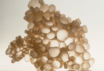
This was my attempt at slab building, based on the plant shadows, using the cross hatching and joining with slip method. It worked – when fired it stayed in one piece! I like the simplicity of the piece and the range of shadows that it can make (see below)

This piece was made from extruded clay from my imagination rather than being based on a photo of shadows, but I could see the potential for it to cast interesting shadows.

In the afternoon we were shown how to make pinched pots using oyster sized lumps of clay, pinched into rounds and used to build a vase. Had we had time, we would then have smoothed the surface with a kidney to create a tall vessel with a handle of our choice. It was important to smooth afterwards rather than as you go along in order to retain the strength in the bottom of the pot.

Lawrences pot

Jacks pot

Wojciechs lattice bowl

At this point I fell ill with a chest infection, so we were unable to continue working collaboratively in our own time. I popped back in on the following Thursday afternoon to take some photo’s of the finished pieces in the photography suite with directional lighting to enhance the shadows and to make a still life. Unfortunately I couldn’t find Wojciech’s pieces, but I incorporated 1 of Jacks and 2 of Lawrences:

51298954_10155933810301297_2755276865332576256_n

It’s a shame we didn’t have the chance to work more collaboratively – it would have been good to discuss a composition of 4 components that would come together as a single piece, however I do like the contrast of shapes and shadows that our pieces created – all so different! Organic, angular, smooth, spikey, repetitious, singular.

I would have liked to have had the opportunity to discuss and explore the hidden symbolism of artefacts in the ‘Vanitas’ style of still life with my group and considered making a group of objects that had a hidden meaning, for example the skull, extinguished candle or hourglass are traditionally used as a reminder of the transience of existence, downward pointing triangles representing femininity, butterflies representing the human soul etc…

I would also have liked the opportunity to discuss the possibility of making a single group piece out of several components to cast shadows on each other rather than on a flat surface.

Collaborate: Interior Design/ADT Brief

The Interior Design/ADT brief was to create 2 x A2 interior collages using Photoshop reflecting 2 opposing words which were to be drawn out of a hat. Our words were Global/Parochial. Our team was made up of myself and Lawrence from Maker, Wojciech from ADT & Jack from Interior design.

Our ideas developed from discussing the various associations we had from each word, starting with global. We started with words rather than images to get us started – something we could do together rather than silently scrolling through images individually.

The words we came up with were things like:

Global: Worldwide, business, corporate, open, expansive, tribal, space, agoraphobia, light, optimistic, huge, massive, vast, travel, flags, countries, cities, landmarks, continents, oceans, artefacts, Pitt Rivers Museum, encompassing etc…

From here we started to look at the slides we were provided with and started to think about how we could interpret these words into images. For example, we thought about the light and decided this should be bright and natural, initially thinking the building should be made of windows, then realising we didn’t actually have to create walls – it didn’t have to be a room, so we scrapped that idea. To represent the Corporate aspect, we decided to have a central character looking optimistically out & up in a business suit, looking out over the ocean towards the world with a path leading across the ocean representing the journey. We looked at the meaning of colours – the colours for optimism are yellow and orange, so we selected a horizon showing the sun rising in yellow and orange hues. Wojciech created the final Global image with our supervision & using images that we had all sourced:

global


For Parochial, I was the only one who had heard of the word, and then only as an insult – as in ‘you’re soooo parochial!’, so after a little group dictionary diving and discussion, we came up with the following word list:

Parochial: Local, small, traditional, relating to the church, narrow, claustrophobic, cosy, inward, insular, intolerant, restricted, conventional, petty, crafts, sentimental, closed, community, focused, pessimistic.

Initially we threw ourselves into this image without giving it much thought and looked for a typical Welsh home interior incorporating lots of traditional Welsh crafts such as blankets and lovespoons and daffodils, but we struggled to make a cohesive image.

After a frustrating day, we got chatting in our WhatsApp group that evening and decided we needed to take a step back and think about the presentation – the final 2 images needed to work together – reflecting but opposing each other. We still needed the central character, but this time rather than a business suit he needed to be in manual labour apparel. Rather than bright, natural light we needed gloomy artificial light and rather than having this feeling of space it needed to be enclosed. Thinking in this way made it clear that we needed to find an image in a mine – very Welsh, very dark and dreary and very claustrophobic!

From a maker point of view, our main contribution was the corporate versus local handicraft/small business aspect.  I know as a maker this includes Photoshop skills, however I would have been much happier getting my hands dirty and making a maquette rather than a photoshop collage. I watched the photoshop tutorials and contributed to the image manipulation on the Parochial image though, finding the main image of the miner in the mine, adding the dying daffodils & editing the Welsh flag photo to look grubby and ragged to fit in with the lighting and mine theme. It was agreed, however, with limited time remaining that Wojciech was much better & quicker at it, so he took it from there, improving the daffodils, love spoon and adding his nod to the religious origins of the word with the bobblehead Jesus.

Parochial

I think we worked well together as a team – we communicated well, made equal contributions and I think we came up with successful final images. I wasn’t comfortable with collaborating – I have learned through my working life that I am not naturally a team player – I am much happier working on my own. Even as a manager I found it hard to delegate, preferring to do the work myself than entrust it to others. Luckily there were 4 of us – if only 2 or 3, I am likely to take over, 6 or more and I will slink into the background. This is something I am very aware of, so I haven’t necessarily learned anything about how I work with others, but I am 42 when the majority are 19 – I can see it’s a worthwhile aspect of the exercise for them.

I had no idea so much was taken into consideration when creating an interior – you are creating a feeling, experience or state of mind by using the features such as light, space, colour, texture, shape and decorative items as tools. Very interesting.

Light project design sheet & group critique

We had a group critique of our design sheets with Pip today. There were 7 of us in the group. One of the main things that became apparent was that my lights smart application was quite niche! Not quite as niche as Martha’s – a light in the shape of her Italian ancestral home that would be linked to the properties motion sensors and flash when edible dormice were running about to annoy her grandad, but niche!  I could see the further potential for Martha’s idea though, which opened my mind to other, less niche uses that mine could be put to.

Martha’s movement sensors could be used for anyone with a second property either in the UK or overseas to alert the owner of movement and get someone to check it out, whether it be pest control for rodent visitors or police for human! My pressure sensors could be used for all sorts of things too – for anyone who keeps stores of anything and needs alerting when something needs replenishing, they could be placed under a doormat to count footfall or to trigger an intruder alert. I had been very focused/blinkered on the beekeeping idea without looking at the bigger picture, so the group critique opened me up to new possible end uses for my design.

Not much was said about mine, I’m not sure if that’s a good or a bad thing!  I had covered most bases – I had researched artists who had influenced my design, researched materials, researched the market for similar existing products, researched my target audience, all of which were picked up as areas to explore further with other members of the group.

It was interesting to see that everyone had developed an idea that would be useful or helpful in some way – nothing entirely aesthetic or frivolous was brought to the table. I felt really sorry for a couple in the group who had got so far with their idea’s only to find upon continued research that their product was either already in production, or had been rendered obsolete by new scientific thinking – lesson learned – do thorough research before investing too much time, energy or money in a project!

Pavement lights

Today we went to Elan Valley to walk off some of the Christmas excesses. I took lots of photos of the stunning scenery, but I also kept an eye out for anything else that caught my attention and these glass rectangles in metal frames on the path around a building by Caban Coch dam fascinated me.

The colours in the glass, rust, lichen, cobwebs, cracks, dirt, reflections and whatever lay below were just so beautiful.

When I got home I googled Hayward Brothers, Union Street London and found this article on the history of the company. Turns out to be quite apt for our ‘light’ project.

https://glassian.org/Prism/Hayward/index.html

Light! The finished tracing paper based lamp.

It turned out so much better than I had hoped!  The flour and water actually form a much stronger glue than I had dare hope and it is actually quite sturdy. As there are some cones with no paste on, and some with a dark and heavy paste, the light is of varying strengths all the way around which creates interest. Because of the opaqueness of some of the cones, light is also tunnelled into spotlights that beam onto surrounding surfaces, creating additional patterns & interest. It could be made in any bespoke colour combination to suit any room/decor. I know I share too many images and should probably should only have half of these, but I couldn’t resist:

Lights and bees and tracing paper

I had a very useful chat with my husband, who keeps bees. I was telling him about my day and the amazing technology that Ingrid had shown us (IFTT & SamLab) & he got very excited about how this technology could be helpful to him with his beekeeping.

To be honest, I was delighted that he found a hobby when he started the beekeeping course, but he soon became a total bee geek and I stopped listening to him, so I don’t know a great deal about it! But he was saying that through the winter they don’t exactly hibernate, they just huddle together to maintain an constant temperature . As they can’t go out much – they need to maintain the temperature, and there’s not much pollen to be had anyway, they rely on their stores of honey to feed on and see them through the winter months. Because beekeepers take honey from the hives in the summer to use and sell, depleting their bees winter stores, they help their hives through the winter by giving them additional food in the form of sugar syrup or fondant to make sure they have enough to see them through. They have to keep disturbing the bees when checking how much of the syrup or fondant is left, which is a risk to the bees and can only be done on sunny calm days which are few and far between in winter!  Peter said it would be great if there was a way of notifying him if it was running low to minimise bee disruption. 💡

Peter, Jill & Andy checking the hives

So this is going to be my idea for my design sheet. It might be a bit niche – only aimed at beekeepers, but it would be very useful to that niche market! I will research the SamLabs blocks that we were shown by Ingrid as they have a pressure sensor which would be able to measure the weight of sugar syrup or fondant left and send an alert via my light, either by changing colour, or as it’s bee-related I quite like the idea of keeping the light colour the same but making it buzz when the weight drops below a certain point!

I have done a little research and only found one product similar to my idea:

Heart of Hive

It does a lot of things but doesn’t specifically measure the amount of food left, which from what my husband has said and what research I have done is the only thing you really need to worry about with bees through the winter. The rest of the functions might be of interest to some, but the enjoyment for most beekeepers seems to be checking the hives for these things themselves, going to beekeeping meetings etc…it’s a hobby, not a means of getting honey.

I want my actual light to be related but in a more abstract way – no bees, honeycomb or honey yellow! I just want it to be a beautiful object you would be happy to have as a bedside lamp or on your side table in the lounge to compliment your decor.

I brought a sheet of tracing paper home with me and started playing with it – seeing what happened when I put clear varnish on it and how soft pastels behaved on it (my favourite/go-to medium).

The first thing that came to mind when we were told about the tracing paper was some artwork I saw in the RWA annual open exhibition a few years ago. Laurie Steen is an RWA Academician who sketches trees on mylar – a form of tracing paper. I’m not 100% sure what medium she was using, but from the ethereal ‘smudginess’ of the backgrounds, contrasting with the sharp black lines of the trees, it looked like charcoal.  This is what made me think of working with pastels – I keep saying it, but I love colour so prefer pastels to charcoal – they behave similarly though. My plan had been to simply make a pastel sketch of our beehives on the tracing paper – they are in a beautiful landscape setting as you can see from the photo above – then putting it in a box frame with the light behind it so it would be a decorative artwork during the day and a useful light by night. But then I thought that might be a bit more Fine Art than Artist, Designer, Maker.

22405570_10154954019806297_9034027555867155718_n22406399_10154954020151297_336071857090086728_n


I then thought about manipulating the tracing paper, but I didn’t want to jump on the bandwagon & do origami, so I ruled that out straight away. I came up with making little tubes which when joined together looked like a wasps nest structure, not quite on topic, but not a million miles away! I wasn’t sure how to turn this structure into a light, but then I thought if I made the tubes conical then I could make them into a dome over an upturned bowl as a former which could be removed once the glue had dried. The light bulb would then sit in the centre, et voila!  Lamp!

Ecology is a major reason beekeeping is becoming so popular, with the worrying decline of bees across the world. When I realised I needed to glue bits together, I thought it would be appropriate to try using organic flour and water to make a glue paste like I did when I was a child. Not sure how long it will hold, but there’s no plastic in it and by using organic flour, no pesticides will have been used in growing the wheat. Pesticides are thought to be one of the main reasons behind the decline of bees. It would also be possible to add subtle colour to the paste by going back to my original thought of using pastel – I could simply make a powder from soft pastels to add to the flour and water.

I was horrified when I later searched pinterest for ‘tracing paper light’ and found images almost identical to what I had made by a San Francisco artist named Mary Button Durrell! It even said she used paper & wheat paste to make them (i.e. flour glue!!!) So much for my original idea…

Image result for mary button durell

I considered going back to the drawing board, but I had limited time and I had already invested half of the time I had in this idea by this point. I decided mine will be different enough, as I will be colouring the flour and water glue with pastel dust, it will be smaller, dome shaped and a lamp rather than a sculpture, but I was still pretty devastated!

Also, on further research I found that tracing paper is not very environmentally friendly – it is not recyclable as it is made transparent by using cellulose fibres to make it translucent. Tracing paper is essential to the project though, so there’s nothing I can do about that. If I were to make it for real, then I would consider making it out of another material, perhaps clay.


Soldering

Today we started our first ‘field’ module. We have to make a light using only the bulb, tracing paper and one other material. We also need to prepare a design sheet which can be more of a fantasy design – something we could make if we had all the the time, materials, funds and techy knowledge we required! I have some research to do for that one so more blog posts will follow, but for now I am working on the physical light that must be completed by next Tuesday.

We had a soldering tutorial which I will be documenting here – the light design will be in my sketchbook where it’s easier for me to scribble and sketch images and ideas.

Soldering an LED bulb to wires in order to make it attachable to a power source:

The bulb has a longer and a shorter metal prong. The longer is the positive, the shorter the negative.

You will need equal lengths of red and black wire. Red is positive, black negative. Prepare the wires by stripping about an inch of the end of the wire of its plastic coating, leaving just the metal exposed. Twist the metal to keep it from splaying.

Twist the metal part of the red wire around the longer prong and the metal of the black wire around the shorter prong. Place one of the wires in a grip/vice.

Make sure that the tip of the soldering iron is clean by wiping it on the wetted sponge. The temperature of the soldering iron should be around 300 degrees (just past half way on the dial). Use the tip of the soldering iron to heat the wire and prong – solder is attracted to heat, so if you try to solder it cold, it may just drip off. After heating for around 10 seconds, apply solder.

The solder will produce smoke/fumes. Do not inhale this – if only doing a small amount of soldering in a large well ventilated room then just move your head out of the way, but if you are in a small room or are doing quite a bit then use an extraction system or wear a mask.

Once you have soldered both prongs, you need to cover both connections with heat shrink tubing to protect them. Put the tubing in place and use a heat gun to shrink securely in place.

You will then need to strip another inch of plastic coating from the other ends of the wire in order to attach it to the power source. The power source will have 2 wires – one has a white stripe (positive) and one is plain black (negative). For our tutorial, Jon attached the power source wires to a chock block, which we then touched our wires to to check that our soldering was good and the bulbs worked. Once we have a plug I guess we solder them together (check with Jon!)

Always make sure you attach positive to positive (long, red, white stripe) and negative to negative (short, black and solid black) otherwise you will kill the bulb.

Light

For our first Field/Collaborate module the theme is light and we have been asked to write a research blog post on this theme including 3 images with a short explanatory text.

It is something that has been on my mind lately as now that the clocks have gone back and the nights are longer, a lot of places that you would normally visit during the day and in the summer months such as gardens and stately homes are trying to increase their winter revenue with nighttime events involving light installations.

https://www.enchantedforest.org.uk/

https://www.edenproject.com/visit/whats-on/shadows-and-light-christmas-experience

https://www.rhs.org.uk/gardens/wisley/whats-on/glow-at-wisley

I guess this raises the question of whether these installations are art or just christmas decorations/events. Where do you draw the line? I’m not so sure, so I’m not going to include them in my 3 pieces, but just thought I would mention as it’s something that’s been on my mind!

So…

  1. Dezeen

Since Pip recommended I look at the Dezeen website for my design sheet I have been hooked!  Here’s a couple of lighting designs I’ve seen on the Dezeen website:

Jesse Ede – Orbit Light

https://www.dezeen.com/2018/08/30/orbit-light-jesse-ede-lighting-design/

Orbit Light by Jesse Ede

I love most things about this – the concept, the way the light goes from a warm glow reflected in the shiny bronze interior or a cool blue when reflected from the blue exterior, that you can swivel it around, that “According to the designer the dome creates a “waxing and waning shadow” on the ceiling above the light, creating an ever-changing cinematic experience.” It’s just beautiful and clever and could have been cheap and tacky looking, but it’s very elegant. If you click on the link there is a video of it moving around. I was a bit disappointed that it has to be manually turned. I do wonder whether it can be made to properly orbit around though – so it’s constantly moving a tiny amount and maybe goes from the bright blue in the early evening to the warm glow later when you’re wanting to relax and getting sleepy.

Haberdashery – Dawn to Dusk lamps

https://www.dezeen.com/2018/09/02/haberdashery-dawn-to-dusk-table-lamp-colour-changing/?li_source=LI&li_medium=bottom_block_1

Haberdashery Dawn to Dusk lighting

I like the idea behind this and that it might actually be helpful as well as beautiful. I like that the light slides up and down and changes colour, but I wonder if it can be made to come on as dusk falls and go off as dawn approaches, gradually changing in line with the sun on the opposite side of the hemisphere rather than having to be manipulated?

There are loads more interesting new designs – these are my 2 favourites!

2) Bruce Nauman – Neon artist

Bruce Nauman, ‘VIOLINS VIOLENCE SILENCE’ 1981–2

A lot of Bruce Naumans’ neon work portrays quite graphic sexual images, which aren’t really my thing, but he has done a few that aren’t so shocking. I get that neon lights are often associated with advertising, especially in seedy parts of cities and red light districts, but the pieces I like are the ones where he uses the flashing on and off of different lights to play on words, rather than making figures perform sex acts!

I chose this piece as it exploits the properties of neon lights. The wording is around the top of a building with 7 vices and 7 virtues overlapping each other – the neon lights alternate depicting either vices or virtues.

3) Antonio Gaudi – Sagrada Familia stained glass windows

3VITRALLS_ESCALES_ABSIS_035

http://www.sagradafamilia.org/en/light-and-colour/

For my third piece I wanted to explore stained glass windows. I am not religious, however I love colour and am fascinated by the idea of using the light of the sun to illuminate images and project them onto white walls like temporary light artworks.

Gaudi is better known for his architecture and mosaic work, but the windows in the Sagrada Familia are stunning. Unfortunately when I visited 20 years ago I lost my camera, so I don’t have any original photo’s, but the feeling of the colours washing over me will stay with me forever. They had only done one side when I visited, so I didn’t get to see the contrast between the scenes that are illuminated by the morning sun and setting sun.

Design a site like this with WordPress.com
Get started