Artist Inspiration – Miss Fire metal artist

This isn’t really relevant to anything I am doing right now, but I just love her work!  I follow Miss Fire metal artist (Clare McHugh) on facebook and instagram and she has just shared this image of her current work and I had to write a blog post about her:

No photo description available.

This piece is a collaboration with a woodworker Peter Walwin – the frog is a carved wooden sculpture and the rest (copper & steel) is her metalwork. It’s not finished – she will spray the bullrushes, lily and lily pads and water ripples, but to be honest I like it as it is – I like that you can see the materials and you know what colour they should be…let your imagination do the work.

She inspires me for many reasons, not least of which is that she is a woman doing what would be perceived as mans work – hot forges, hard work requiring physical strength, I admire that. She’s also a relatively local artist from Drybrook in Gloucestershire – I like to follow local artists as well as international and well known ones.

I would love to create garden sculptures as my other passion is gardening. I first saw her work at Showborough House Affordable Garden Art Exhibition back in May:

Image may contain: plant, grass, outdoor and nature

This piece was called Ballerina. I like the scale of her work – it fits into a garden landscape perfectly without getting either lost in the foliage or unduly detracting attention from the plants. Here’s her website for more information:

Miss Fire

Pavement lights

Today we went to Elan Valley to walk off some of the Christmas excesses. I took lots of photos of the stunning scenery, but I also kept an eye out for anything else that caught my attention and these glass rectangles in metal frames on the path around a building by Caban Coch dam fascinated me.

The colours in the glass, rust, lichen, cobwebs, cracks, dirt, reflections and whatever lay below were just so beautiful.

When I got home I googled Hayward Brothers, Union Street London and found this article on the history of the company. Turns out to be quite apt for our ‘light’ project.

https://glassian.org/Prism/Hayward/index.html

Design elements and principles 2d to 3d

“Deliverable 1 – Principles and Elements From 2D to 3D
You should have a 3D outcome that has been made as an exploration of particular principles or elements of art and design as discussed during the module. This outcome will be developed from your 2D visual studies exercises conducted in the first two weeks of term
and will be shown in the studio alongside the original 2D drawing that inspired them. As well as foregrounding one or two of the principles of art and design, consider the relationship between the 2D image and the 3D outcome.
Assessed on: effective application and manipulation of materials and media (skills / ideas),
clarity of exploration of the elements + principles of 3D art and design (ideas / context)”

See my sketchbook for my inspiration photo’s and initial idea sketches and idea development.

Once I had settled on the idea of making a sculpture based on the results of placing a Piet Mondrian painting in a Yayoi Kusama infinity mirror cube, I needed to do some experiments to see what it actually would look like.

I got 6 small square mirrors and joined them together loosely with sellotape so that they let in enough light to see what was happening inside and I could use the lens of my phone camera to capture the images I needed. I realised that if I just put a flat image in the mirror cube, then this would just create planes of pattern which would be rather boring. Also, mondrian painted on canvas, so it would have some depth to it, so I thought wood would be a suitable material as it’s the right thickness and I could paint it. I found a few scraps of wood and had a little play.

At this point I hadn’t added colour – I was looking at the lines formed by the corners, the repetition of the objects – where did they go? How did they reflect? It was interesting to see how the lines distorted if you make one gap bigger – you can make the reflections curve around and do all sorts of funny things! When I added colour I was amazed to find it looked like a huge office space! Having the gaps to allow in the light and trying to take a photograph was obviously distorting the reflections, but I had enough to go on – I knew where the reflections were going and it was time to make some cubes to scale of Mondrian’s composition number 2.

In the meantime, I went to the Museum of Modern Art in Edinburgh and saw a real life Mondrian. I was taken by the fact that close up, you can see the brush marks and the canvas threads – it isn’t as clinical and flat and precise as you imagine. This re-inforced my resolve to use wood.

When I got back I measured an image of composition 2 taken from the Tate website and scaled it down to a manageable size. I then cut blocks of wood and painted them according to the composition. When I placed them in the mirror cube, I felt that it was still a bit flat, so I took out the white blocks. I did this because I felt that whilst one of the elements of design that my sculpture was to showcase was plane, t didn’t make for a very interesting 3d sculpture as it would just be 4 layers of the same thing. By taking away some of the blocks, it made vertical spaces through which you could see the other layers.

I decided I would have one central cube which would be the mirror cube, with a reflection cube around every surface – 9 cubes in total. I cut and sanded my blocks then painted them with acrylic paint.

I spot welded my frame, unfortunately I forgot to take photo’s of this process. This is where my project went wrong…I should have asked for assistance in holding the metal rods steady and in place whilst spot welding. I didn’t and as such my welds were off mark and the cube frame was not geometrically correct. This meant that the blocks didn’t fit properly and had to be sanded, so everything is off kilter. I persevered anyway with my wonky cage and wonky blocks, attaching the wood to the metal with superglue. Both Dallas and Martin assured me this was the best thing to use and Martin gave me a useful tip that if you but baking soda on the superglue it will set instantly!

In the meantime, I went to the Tate Modern and saw a Yayoi Kusama mirror cube in person – see blog post about the After Modernism trip to Tate Modern for more information – I won’t repeat myself!

At this point, I was feeling very dejected as I didn’t like the paint finish either – it looked like childrens toy wooden blocks. I decided to persevere and finished attaching my uneven childrens toy wooden blocks into my wonky, geometrically cringeworthy frame…I spoke to Jon about it and he said he didn’t mind the wonkiness of the frame as it added a distorted perspective element, but he agreed about the wood. He didn’t understand why I hadn’t used plastic – acrylic or perspex. I’m not very good at thinking on my feet, but I have explained here my reasons for selecting wood and a paint finish. To add depth & the brushmarks I hadn’t expected to see on the Mondrian – to see the makers marks.

Thinking about this, I thought maybe the problem was the paint. The Mondrian was clearly oil paint – maybe I just needed to go over the acrylic with oil paint. The acrylic paint had acted more like watercolour & had been absorbed into the wood like a stain – you couldn’t see the brush marks that I had wanted to achieve.

I repainted my blocks with oil paint and was much happier with the final result.

Thinking inside the box

“Deliverable 2. Thinking inside the box.

As an introduction to the wood workshop you will be taken through the necessary processes to make a simple wooden box with a hinged lid. These boxes look fairly uniform from the outside (varying slightly in size) but what will you create on the inside of your box to make it unique and express your own individual aspirations as a maker? Possibilities include decoration, texture, a small sculptural artefact, something functional, something re-appropriated and numerous other possibilities besides – surprise us! Post two images on your blog as context for your box interior.”

So up to here is covered in my post “Woodwork Workshop – making a box properly!”, now I need to consider the deliverable 2 brief. I was very proud of my box and wanted to make it functional. If it were to tell you something about me, what would I want it to say? Well I have 2 main passions in life – art/craft/making and gardening. You know about the former so I decided to make it about the latter. Here’s me at my allotment (well, veggie patch on my friend Jill’s land!) The main thing I love about gardening is growing things from seed, whether it be flowers or vegetables. From February, my lean-to shelves are stacked with little pots of seedlings. I love growing things from seedpods I have collected as well as packets of bought seeds. I just love the moment the first green shoots pop up, then nurturing them until they are big and strong enough to go outside. To be honest I lose interest at that point – Jill usually ends up propping up my beans with canes and harvesting most of it!

21192403_10154850408441297_3401664420396062259_n

The obvious functional use for a box in relation to gardening is to keep seeds cool and dry, so I decided to make index cards to store my seeds alphabetically. I considered using the months to sow things rather than alphabetical index cards, but April & May would be packed and the rest a little sparse!  Many seeds can be sown over several months, so I decided to go with alphabetical.

I used my laser cutter induction to make perfectly fitting index cards!  Squee! I was so excited that I had measured right and they were just right. I then started working on the lino print (see sketchbook for inspiration photo and sketches).

I also decided to decorate the inside of the lid with a lino print. Colour is hugely important to me and will always be a central consideration in anything I make. I was trying to find an image to represent my love of colour, and thought my yarn stash might demonstrate this…unfortunately it wouldn’t all fit into a single photo, so here’s a collage! I do love knitting and crocheting, but I think my love of colourful yarn is a major part of that – I often just buy random skeins or balls because I like the colour and just go through it to relax, seeing what colours look good together. So there’s my guilty pleasure…

Anyway, back to the lino print idea…After looking at a few forums on the subject of lino printing on wood, it became clear that standard printing inks wouldn’t work on wood – they rely on the paper to absorb the ink in conjunction with the pressure of the baren. A wood surface will not absorb the ink. You therefore require a medium that will adhere to the surface rather than be absorbed.

I tried using a printing medium that can be mixed with oil paint as I thought that this might meet the requirements. I must confess it was a failure and the paint just squidged onto the wood rather than covering it, but the frosty window style pattern that the second layer made on top of the first was so lovely that I felt I should make a feature of it rather than wiping it off and starting again. I changed the texture of the background to differentiate it from the seedheads rather than adding a third layer of paint by stippling with a paintbrush. This meant I was missing the blue I had planned to add to balance out the colour scheme, but after further consideration I added copper highlights as I love oranges, pinks and purples together.

It would have been better if I had considered the final piece before I made the box as it isn’t quite big enough for my seed collection, and indeed some seed packets, however it is perfect for seed packets that have already been opened and need to be kept somewhere safe for the next sowing season. Many seeds are viable for several years.

Form and Function

Deliverable 4. Form and function.

Choose an item to use for ceramic slip casting – a process traditionally used for making domestic vessels as well as decorative pieces. You will be taken through the necessary steps for making the mold and casting as well as joining and modifying leather hard slipware before firing. Consider whether your outcomes are based more on form or on function providing a brief assessment on your blog as to which category the outcome may belong to. Document your work on your blog at each stage – particularly in case it is in the kiln during assessment week!

For my slip casting workshops I chose 2 items which would fit into both form and function, so this is tricky! I didn’t make it easy for myself.

I chose a vase and a diffuser scent bottle – both of which need to perform the function of holding a liquid, so both will need to have no holes and both will need to be glazed on the inside so that the vessels don’t absorb the liquid placed in them.


Having said that, I also selected both for their form. I have loved my Mum’s 1970’s amethyst glass vase since childhood – it’s so tactile & heavy and sensuous. It’s an organic shape that has always reminded me of a sea urchin, others have said it reminded them of a pumpkin or an orange with the segments.

The diffuser bottle on the other hand is a lovely geometric shape – when bottles are usually tall and thin, this one is short and fat!

On balance I would say the form is proabably more important for the vase because if it wasn’t funtional and I couldn’t put flowers in it, I would still love it anyway as an ornament.

I don’t feel the same way about the bottle – if I couldn’t use it, I would throw it away, so in this case I would say the function is more important.

Design Elements and Principles 2 d to 3 d – Stitch

“Deliverable 5. From 2D to 3D – elements and principles in CAD / Stitch.

Working with one of your 2D visual studies pieces relating to the elements and principles of design, develop a ‘2D to 3D’ outcome that evidences your skills and effort with either stitch or CAD and digital fabrication. Present the 3D outcome alongside the original 2D
drawing and use the processes of CAD or Stitch to reflect carefully on the relationship between the 2D and the 3D realm.”

img_20181109_151443_7386633156425527841628.jpg

I confess the image I have used was not one of the original 2D visual studies pieces, but a photograph I took on my way home from Usk garden centre one dreary grey afternoon. I was struck by the colours and the road disappearing into a point, emphasised by the line of the fence and the river (which you can’t see in the photo) and had to turn around, drive back and take a photo.

A couple of weeks later when we started the second round of Stitch workshops, it occurred to me that this would make a beautiful stitch pjoject on dissolvable fabric. I could use the design principle of emphasis to highlight the design element of point. The point was the vanishing point of the road and I could emphasise this by making the image circular rather than rectangular and by shaping the piece into a bowl with the point in the centre, further drawing you in.

As soon as I did my first circular sketch of the image I felt it had more of a sense of movement and definitely emphasised the central vanishing point. I could see that by bringing the edges towrds you & pushing the central point further away, this would enhance this further.

img_20181114_1030327034673309713981000.jpg

I sketched the image on dissolvable fabric and thought about the textures I wanted to create. I wanted the trees to be lacey, but the road needed to be more solid to really draw you in to the centre point. I needle felted some black fibre into some black organza and used the cording foot to ass a white cord central line, breaking it up with a zig-zag diamond stitch. I then trapped this in between the 2 layers of dissolvable fabric so that any stitches would hold it in place and also add strenth to the finished piece. I like the idea that the bottom half will be more solid and the top half with the trees dropping their leaves would be lacier and more ethereal.

img_20181116_171530_5028219038351465776075.jpg

Over the next couple of weeks I built up layers of colours and foliage with the free-embroidery foot on the sewing machine, being careful to go over any straight stitched lines with a zig zag to make sure nothing fell apart when the fabric was dissolved. As I was stitching I decided it would be a bit odd as a perfect circle, so let some of the stitching escape the confines a little to give a more organic feel.

At this point it’s still a 2d image – just drawn in thread rather than pencil or paint.

img_20181121_132641_6355707998224407883130.jpg

In order to turn it into a 3d object I cut the excess dissolvable fabric away, dunked it in a bowl of cold water for 2 minutes, squidged it to disperse the glue throughout the piece and squeeze out excess water and placed it inside a bowl, teasing each branch out with a needle and into the position I wanted it. I have done something similar with crochet before, but the thread is much thicker and easier to tease into position! I then left it for 24 hours to  dry and become stiff.


I am delighted with the final outcome. It wouldn’t make a practical bowl as it is quite delicate – definitely form over function. I was a little disappointed with the colours – the glue gives it a permanent wet-look, so the colours are much darker, duller and more subdued than I had intended. Conversely there were unexpected things that I hadn’t anticipated that you inly get from a 3d object, like the spidery shadows cast when light shines through it. Overall I believe it meets the brief – it showcases several techniques that I have learned over the last few weeks of stitch workshops and demonstrates the element and principle of design that I selected as I had intended.


After Modernism – Tate Modern and Tate Britain trip

We went to Tate Modern to see some of the pieces we had been discussing in our lectures/seminars in real life. The idea was that they might have more of an impact on us that the photo’s. In some cases this was true, but in the case of Carl Andre’s Equivalent VIII below, I’m afraid it had the opposite effect on me. In theory I can see that it is an example of minimalism – the use of a single material – 120 firebricks stacked 10 x 6, 2 deep, the simple geometric shape, human sized so not making a grandiose statement about being an impressive sculpture. No plinth or showcase – “what you see is what you see” (a phrase commonly attributed to Frank Stella). No hidden meanings, although it was discussed that the size and shape is reminiscent of a tombstone, especially with the low rail around it to stop visitors getting too close.

But I still find it incredibly irritating. It is just a pile of bricks like you would see on a pallett in B&Q and walk straight past. I get it, but I just don’t appreciate it! Not my cup of tea.

I felt a bit differently about Roni Horn’s ‘Pink Ton’. It still has the same minimalist qualities – single material, big but not larger than life (although it weighs a tonne, it isn’t much bigger than a kitchen table), a simple glass cube not pertaining to be anything else. But it’s beautiful and interesting. I love how it changes as you walk around it because of the light and the surface texture. In the light you can see it is pink glass and the rough outer texture is just where it sat in the mould, but away from the light it looks like it’s been painted with pink paint all around the outside. Where the glass curves at the edges, a naturally occuring effect from the mould process, it almost creates an optical illusion – you don’t know how deep the glass is as it distorts the perspective and the light reflections on the smooth surface make interesting patterns…so whilst it is still a minimalist piece, I still found it to be beautiful and interesting. I still think, personally, that in order for an object to be considered art, it needs to have that special something about it.

And the Kusama mirror cube piece!  I am using a photo of this piece that was put on moodle as one of my inspiration pictures for my 2d to 3d piece, so it was wonderful to see it properly.  Again, something simple and minimalist – one material, simple geometric shape, not too big or small, it is what it is, but the patterns and colours from reflected clothing that it created were the opposite of minimalism! It gave me a new perspective on why she calls them infinity cubes – I had thought it was because the reflections appear to go on forever, but also the combination of patterns and colours are infinite and constantly changing.

After the Between Object and Architecture display that had been the purpose of our visit, we were set free to explore on our own. I found another Barbara Hepworth sculpture – I am fast becoming a fan of hers!  I have said it before but her sculptures are so tactile and inviting, which isn’t a good thing when they’re in a gallery and you aren’t allowed to touch them!  Smooth like an eggshell on the outside, yet you can see the making marks on the inside – in this case it’s cast and carved plaster rather than the polished and painted wood of ‘The Wave’ that has inspired my design sheet. I love the idea that the inside is as, if not more interesting and complex than the outside.

I didn’t have long at Tate Brittain – only 30 mins, so I dashed around taking photo’s of anything that caught my eye. On looking through my photo’s I see a lot of the work that interested me was by Lynn Chadwick, who I had not previously heard of. There are obvious similarities between ‘Fisheater’ and Alexander Calders mobiles, whom we have been learning about in Facture, but they are given life and personality rather than being totally abstract and scientific. I wonder if it would move if a breeze blew through, and if so what would the movement be? It is beautiful and scary at the same time.

Yayoi Kusama – Infinity – The Cube, Bristol 05/08/2018

I hadn’t seen any of Yayoi Kusama’s work except for the big yellow pumpkins with the black spots in the mirror room – and then only because it made the news when someone broke one of the pumpkins while trying to take a selfie!

When Emma invited me to go see the film about her life and her work I decided I would like to know more.

Kusama Movie

According to the film, she had a conservative and challenging upbringing – her mothers family ran a successful seed production company and when she married, her husband unusually took on her surname, suggesting he felt emasculated. It was not a happy marriage, he had many affairs, she became bitter and sent her children out to spy on him. It was hinted that Yayoi encountered her father being unfaithful with a lover in a field of flowers on the farm. It is implied that this image in her mind of being in a field of infinite flowers at a traumatic time may have inspired her obsession with dots and infinity. As she grew up, her mother took her art materials away and told her she needed to find a husband and start a family, but she rebelled.

Image result for yayoi kusama early work

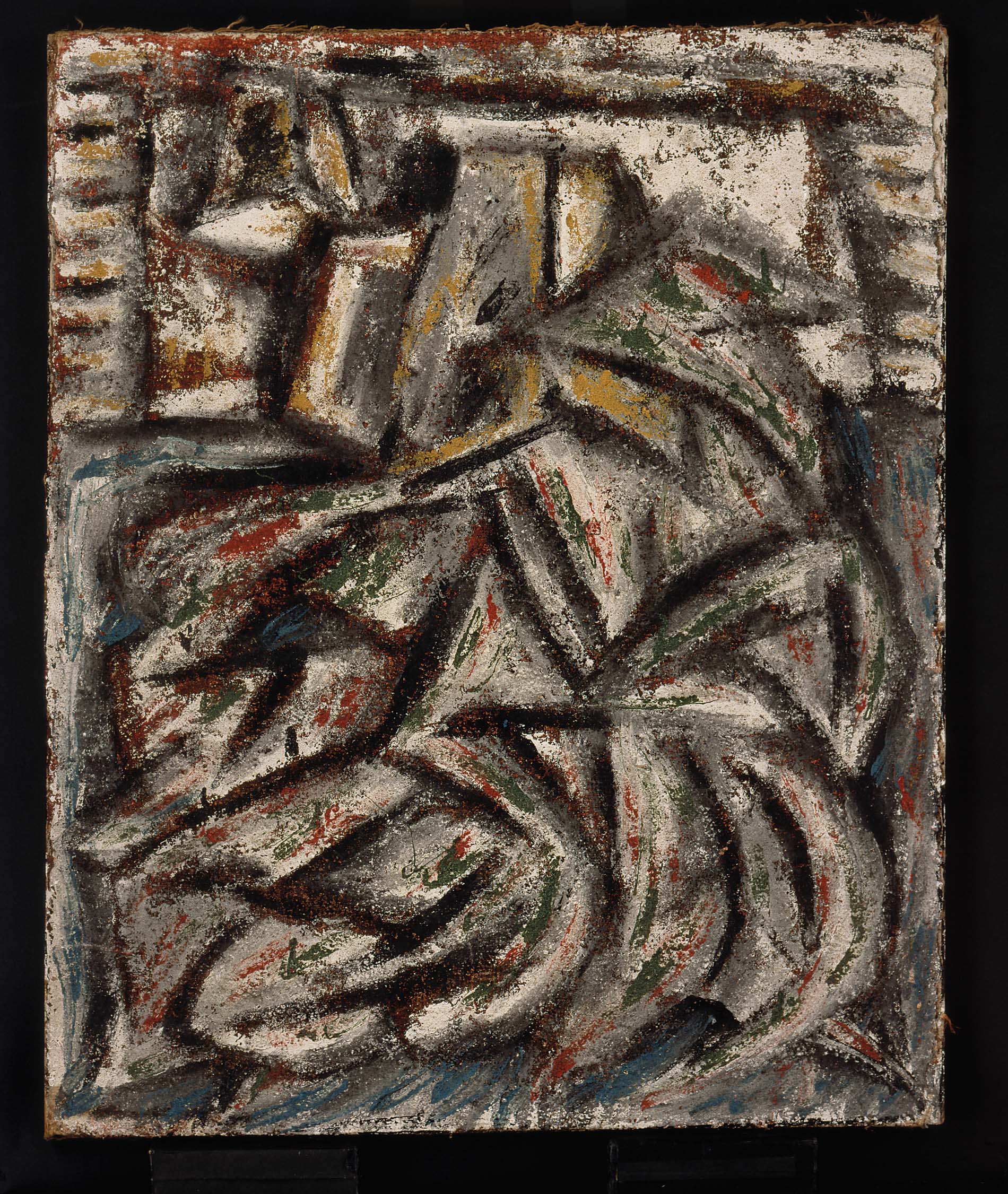
Yayoi Kusama – On the Table – Tate

She tried to sell her work in her home city, but was only moderately successful and she made contact with Georgia O’Keefe, who encouraged her to bring work over to America. She decided to travel to New York to seek more freedom, fame and fortune (a very risky and difficult thing to do at the time!). She tells how when she looked down from the plane she saw the waves on the ocean and thought they looked like nets reaching out for infinity, inspiring her series of huge net paintings.

Image result for yayoi kusama net paintings

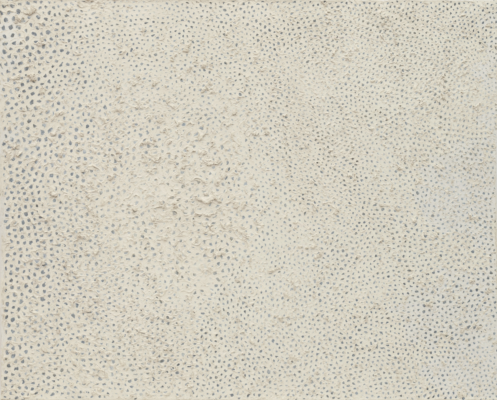
Yayoi Kusama – No. F. 1959 – Moma

Once in New York in the 1960’s and ’70’s she had to be a tough and pushy to get her work shown – as a racial minority and a woman, she was often ignored by the major galleries but she didn’t let that deter her – she fought hard to get her work shown, getting a reputation as a difficult client, but was determined to hold on to her identity as a Japanese Woman, wearing traditional Kimono to private views and opening events. She famously installed herself, uninvited, just outside the Venice Biennale of 1966! She found that her work still didn’t get the recognition it deserved, with many artists such as Andy Warhol, Claes Oldenberg & George Segal taking inspiration from (and credit for, as she saw it!) her ideas and work.

Image result for yayoi kusama boat

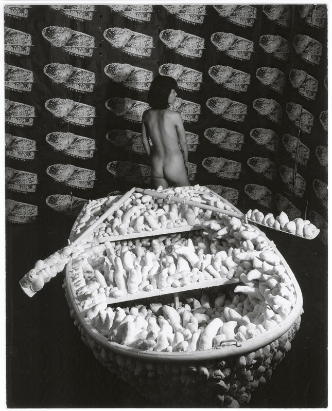
Yayoi Kusama – One Thousand Boats – Tate

She now works primarily in sculpture and installation, but in the 1960’s held many ‘happenings’ involving nudity and polka dots and has made films, written poetry and of course made her series of infinity net paintings.

Her mental health has influenced her art and the film covered this aspect, explaining how seeing the misery her fathers adultery caused left her with a fear/dislike of sex, influencing her ‘penis chairs’ and other objects such as boats covered in fabric phalluses. Her desire for fame left her depressed and suicidal on several occasions and she has been voluntarily living in a psychiatric hospital since her return to Japan in the late 1970’s.

Overall it was a fascinating film giving insight into what her work represents and how her art is her life and her life is her art. I have not been inside one of her infinity rooms in real life, but it is now one of my goals!

Her work obviously links into what we are currently learning across Facture and Concept. Her trademark dot is a design element, so her work is an obvious choice for inspiration for our 2d to 3d design outcome project.

Image result for yayoi kusama

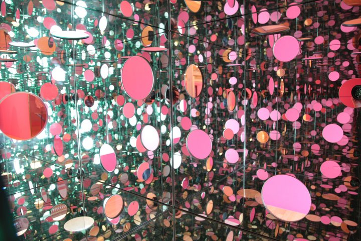
Yayoi Kusama – The Passing Winter 2005 – Tate

It’s also interesting to see where she fits into the Abstract expressionism/pop art/fluxus discussions we are having in our After Modernism lectures for Concept. We have been learning about Claes Oldenberg and his pop art installation ‘The Store’, and in the film, Yayoi Kusama states that Claes never used ‘soft sculpture’ until after he saw and was inspired by her penis chairs. The film also claims that Andy Warhol took the idea of repeating images from her installation of the penis boat, where she covered the walls and floor of the installation with a repeated image of the object itself, yet she has not been mentioned in our lectures. Perhaps she is over-stating the influence she had, or perhaps the sexism of that period is still reflected in our learning.

The film claims she is now the top selling female artist in the world, however I can’t help but feel there’s an emphasis on the word ‘female’. Have things really improved for female artists? I think of Lubaina Himid’s Turner Prize win earlier this year – seen as a big win for female artists, but it was for work produced in the 1980’s…are we catching up?


Edinburgh – Scottish National Gallery and Scottish National Galleries of Modern Art 1 & 2.

Whilst in Edinburgh for a family wedding, we spent the day exploring a few art galleries. Below are the photo’s of art that I found interesting or inspiring . I have included photo’s of the accompanying information and so won’t discuss every piece – there are far too many and you’ll be bored stiff! There are a few that have influenced my deliverables and I will discuss those further in the relevant posts (e.g. the Barbara Hepworth piece has influenced my design sheet and the Mondrian has influenced my elements and principles of design 2d to 3d – see relevant blog posts for further discussion and my personal writing about these pieces.).

Small metals mobile

“Deliverable 3. Small Metal Mobile

Make a small metal mobile. You will learn a number of techniques relating to small and medium sized metal working including spot welding, cutting, casting, forming and enameling. Your task is to bring these together into a metal outcome (or outcomes) that include some kind of mobile or kinetic element. You may introduce other materials as you wish. Consider the work of Alexander Calder and the world of kinetic jewelry as possible inspiration.”

The above is one of my first briefs, and tomorrow will be the 2nd of my 3 small metals workshops, so I thought I would get to thinking about what I could make. I will incorporate what I have learned from the Facture lectures we have been having on Mondays about the principles and elements of design. I also noted that Jon suggested we focus on one element or principle to create more of an impact rather than trying to incorporate it all.

I was inspired by this book cover I saw in the Library:

On the inner cover it names the artist as Jenn Ski, so I had a look on Met Search to see what I could find out about her and found this article:

Print_&_Pattern_Geometric_—-_(37_Jenn_Ski)

I am not planning on copying the design completely – I am thinking of making shapes based on seed heads. I have a penchant for seedheads – I like the organic shapes and I am a keen gardener, so it suits my interests and ties in quite nicely with the mid century modern style. I may also cut out holes so they are not entirely flat shapes. They will be made from enamelled copper. I am also thinking that I will have 3 shapes joined together with spot welded wire formations similar to the inspiration image, then 2 single enamelled shapes and 2 separate spot welded wire formations.

For the decorative wire work, I am thinking of exaggerating the mid century modern style. Whilst I wasn’t alive in the 1950’s, I have seen lots of cartoons and tv shows such as Bewitched, which were all a bit space age and included stylised planets with rings around them and sparks and stars, so I want to add some of those in to the design. I like the contrast between the round organic colourful shapes and the black linear, angular design of the wirework so I will be keeping it all straight – no curvy planets – just the sparky stars.

Image result for bewitched 1950s

Here are my annealed, cut and filed shapes ready for enamelling

I love colour, and the brief said to consider the work of Alexander Calder & he used bright colours, so I will be making them as bright and varied as possible with enamel on both sides in different colours.

Making the wire shapes. Considered addin geometric flat shapes as per the inspiration image but decided I didn’t like them as they detracted from the organic enamel shapes.

How to hang them? After borrowing a couple of books from the library on mobiles (Making mobiles – Anne & Christopher Moorey – 1966) and (Mobiles – Peter Mytton-Davies – 1971), I decided that they needed to hang in a stright line and spin individually in the breeze – a a complicated suspension system wouldn’t really serve any purpose – they would look much better static and twirling as they fit nicely together.

Now I just have to find somewhere to hang it!

Design a site like this with WordPress.com
Get started